13 Ways to Love a Rustic Wood Wall
Here at Marnie Custom Homes, a good rustic wood wall is practically a signature home feature. We love them for so many reasons: they have a weathered, natural feel; they add interest and texture; they create a not-so-neutral backdrop and focal point for other elements, but can also shine on their own; and with the colder months just around the corner, they infuse a home with just the right amount of warmth.
Thinking about adding a rustic wood wall to your home? Check out some inspiration and things to consider first:
Use a wood wall to add texture to a neutral space.
In this inviting bedroom, the wood wall adds contrast – both in texture and color – to a neutral white and gray palette. I especially love how this homeowner used the colors in the wood as a jumping off point for the rest of the room’s decor.

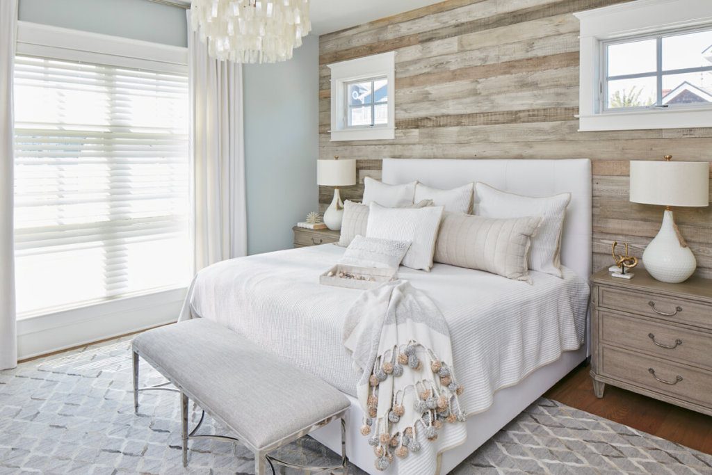
Balance a luxe space with knotty, natural wood.
This dreamy bedroom has luxurious on lockdown, from the tufted headboard and the plush bedding to the spa-like color scheme. Here, knotty, weathered wood grounds the luxe space the way only natural elements can.
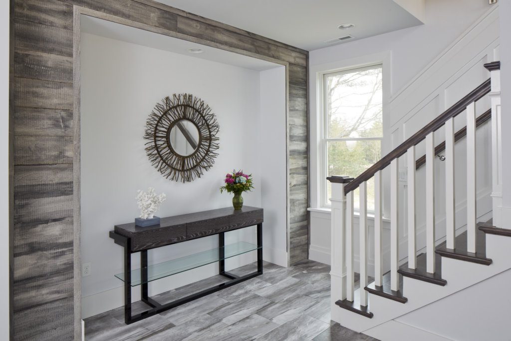
Create an instant focal point.
The most beautiful homes are those that consider every surface and leave nothing undesigned. In this home, the addition of a small alcove framed in weathered wood creates an instant focal point that makes this easy-to-overlook space a star.
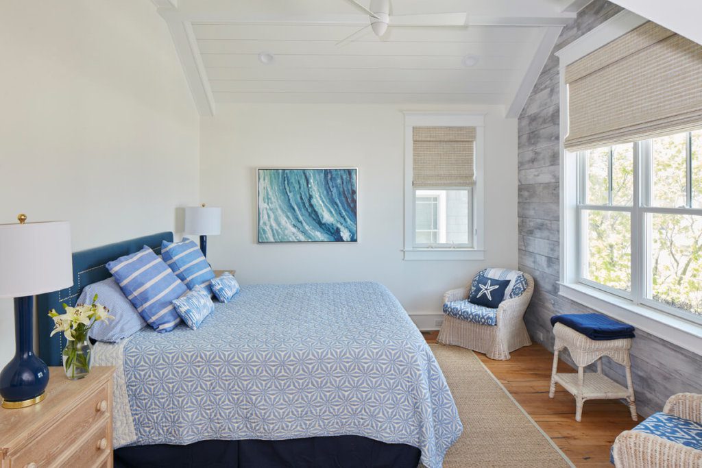
Frame a killer view.
This master bedroom has everything going for it – soaring ceilings, plenty of space, and an abundance of natural light. But my favorite thing about this room is the amazing view. In case there was any doubt as to where your eyes should go, beautiful wood acts as a frame for the natural beauty just outside.
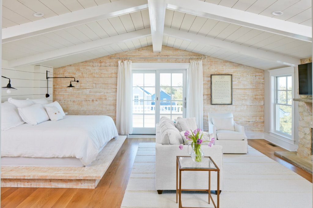
Take other woods into consideration.
In my personal master suite, seen here, I knew that I wanted to add a rustic wood wall because I love what they do to a space. In order to have it complement, instead of compete with, the other woods in the room, I made sure to match the tones in the floor, and then repeated the same wood in the bed platform.
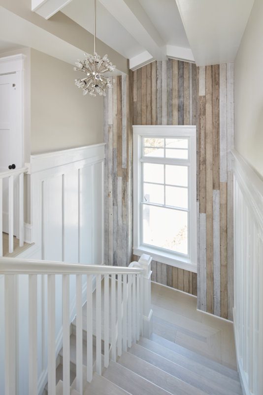
Embrace transitional spaces.
There’s no bigger bummer than walking into a home with impeccably designed living areas that are connected by dull and boring transitional spaces. Take advantage of what is often a missed design opportunity by cladding your landing with reclaimed wood. BONUS: The vertical placement of these planks draws the eye up to the lofty ceilings.
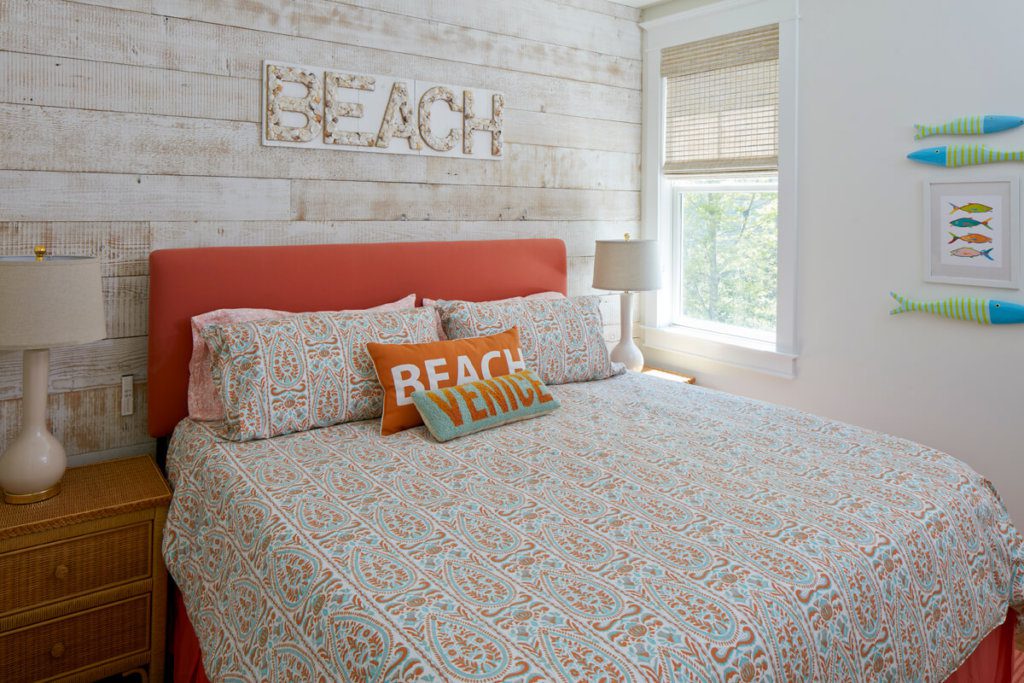
Set the mood with a whitewashed wood wall.
Afraid of a wood wall looking dark and heavy in your space? Go the route this homeowner did and try a whitewashed version. This simple solution adds texture and interest without weighing down the room.
Highlight architectural features.
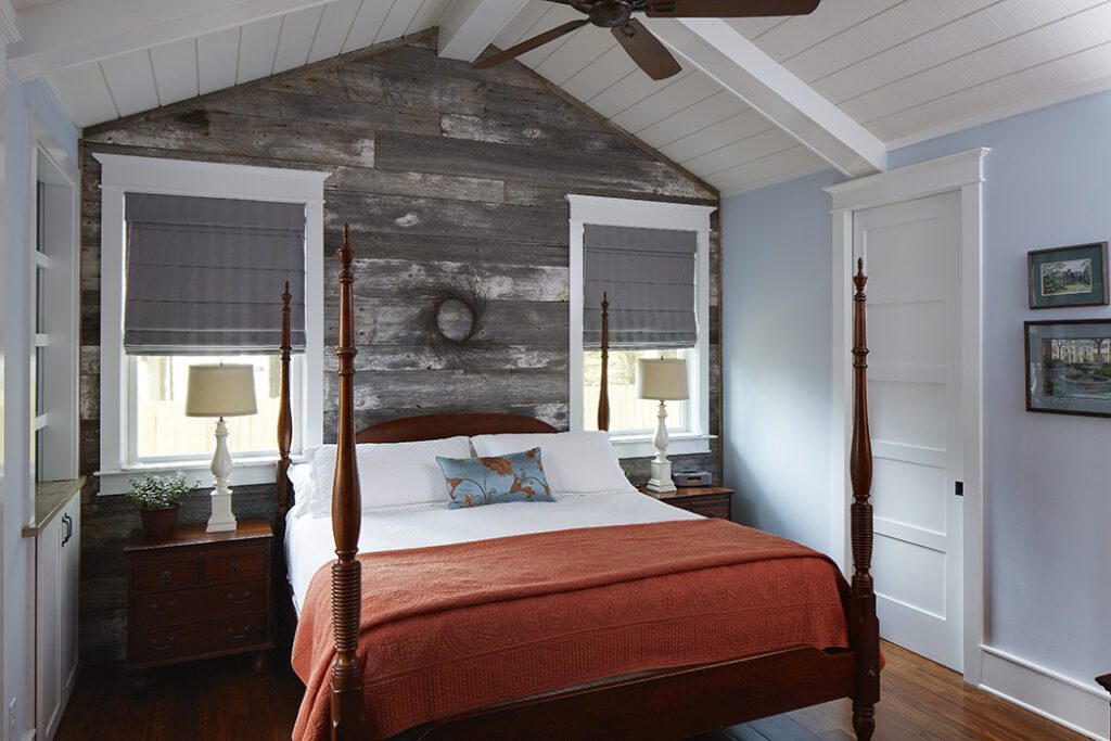
What this intimate bedroom lacks in square footage it more than makes up for with charm and character. Here, a perfectly gnarly wood wall highlights a pitched ceiling, with the exposed beams and shiplap as the icing on this beach cottage-y cake.
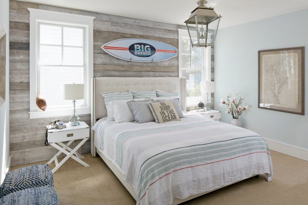
Make a nod to your home’s location.
It’s pretty hard to forget you’re at the beach in my house, but I like remind guests where they are without hitting them over the head with it. In my guest bedroom, a slightly nautical lantern, an apropos pillow, and a surfboard mounted to a driftwood-inspired wall do the trick nicely.
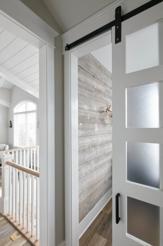
Consider every angle.
One of my absolute favorite things about this homeowner’s wood wall is how it looks when you’re not inside the room. This little peek of texture from the hallway is not only a playful invitation to come in, but also ties the room to the rest of the house.
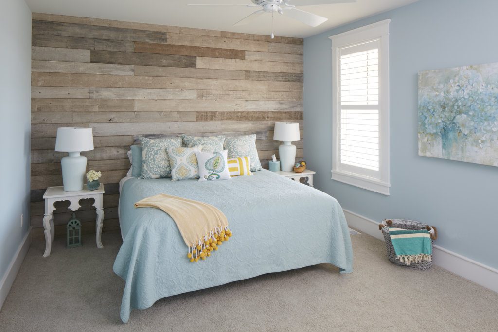
Look for (or create) variation in your wood.
I love a wood wall that isn’t afraid to color outside the lines. The beauty pictured here – with its subtle variations in tone and texture – needs little else to make it shine.
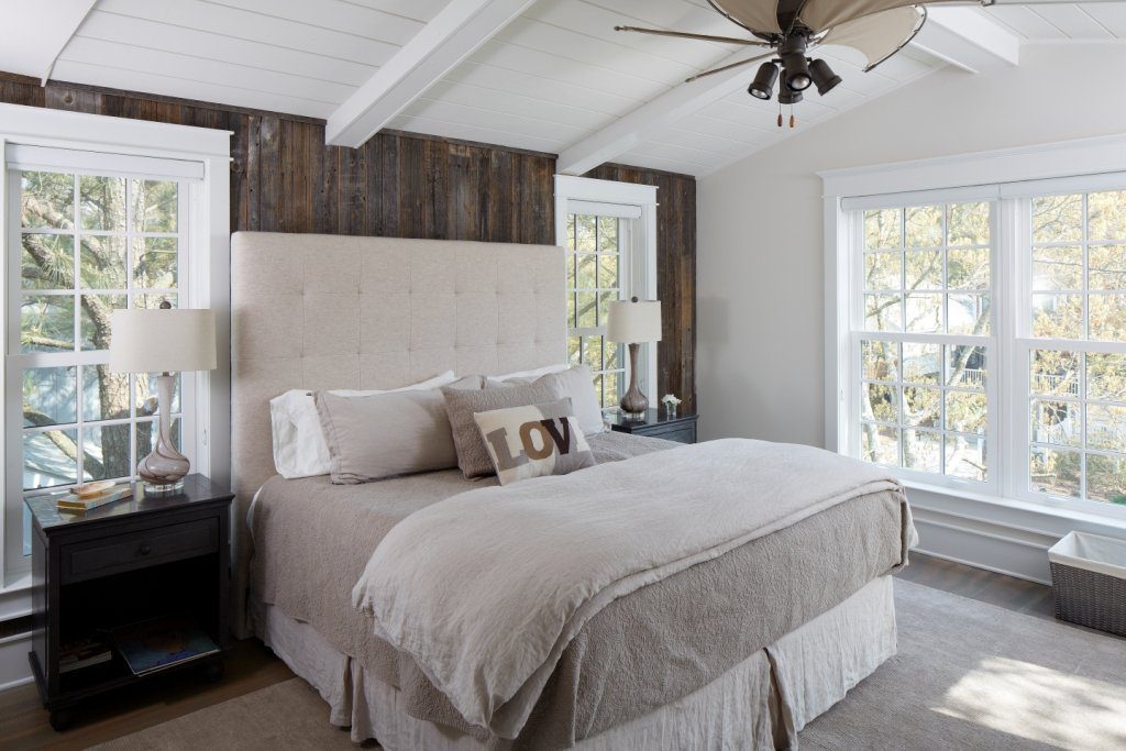
Go vertical.
This bedroom is one of my favorites that I’ve built. Not only does the dark wood wall add gorgeous contrast in this light space, but it’s verticality creates visual height and a sense of age, as it almost looks like the original wood in an old home.
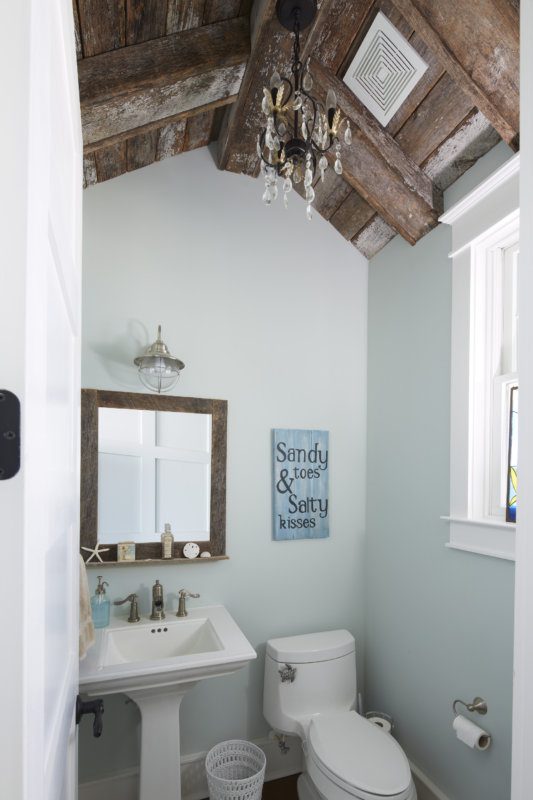
Make the most of the fifth wall.
Anyone who knows my work knows I’m a big fan of the fifth wall. Ceilings are so often overlooked, when really they should be embraced as another design element and an opportunity to add personality to your space. Case-in-point: This wood ceiling takes this powder room from basic to magazine-worthy.
Cheers to building better,

